The big push from Google for webmasters to develop their sites in a more user-friendly way by making site speed a core consideration has been huge over the past few years.
I am not just talking about the small ranking boost you get from having better site speed. Take a look at the amount of new resources, content, and tools, Google is outputting to help developers make sites faster:
- web.dev – Guides on accessibility, best practices, and speed optimization
- A better pagespeed insights tool that utilized user-centric performance metrics
- WebP – an image format that offers smaller files sizes to traditional jpeg and PNG
- Guess.js – Machine learning-based prefetching of pages
- Detailed performance optimization guides on developers.google.com
- AMP – A controversial mobile speed optimization framework
- Brotli – An improvement on Gzip compression
- PageSpeed Module - Apache & NGINX module by Google, which allows users to automatically optimize CSS, JavaScript, optimize and lazy load images, and much more.
On top of that, you have also got big players like Cloudflare pushing the web forward by making these types of things easier to implement on their edge server network and mostly for free.
We are currently in the midst of a golden age for page speed optimization, where the amount of knowledge being shared is better than ever before, and implementation is becoming easier.
And why should you care?
The impact of proper page speed optimization on businesses is huge. Recent data suggests if you improved page load times from 5.7 seconds down to 2.4s, your conversion rate could be more than tripled.
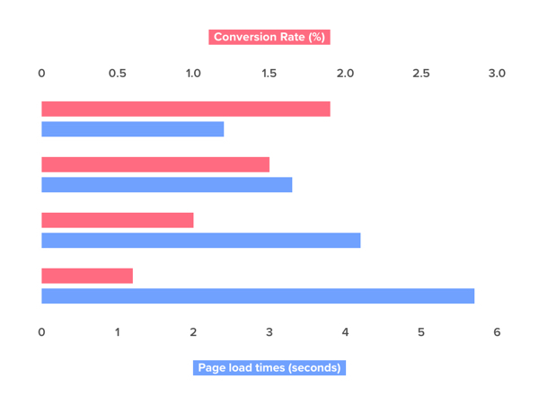
For large businesses with hefty targets to hit, does improving revenue from your site by three times as much sound appealing? Of course, it does!
If you want to see the potential impact site speed optimization can have for your site, run your homepage through this tool from Google. Once it has evaluated your site, there is a handy competitor analysis tool and a revenue projection tool that estimates the potential revenue increase if speed were to be improved.
So, if you have done the basics when it comes to site speed optimization (Gzip compression, browser caching, decent hosting, etc.), and you are looking for some more advanced tips on how exactly to improve site your site speed you’ve come to the right place.
What I am going to show is some more ways you can reap the benefits of site speed optimization outside of the basics, with a focus on improving user-centric performance metrics and the critical rendering path.
What are user-centric performance metrics?
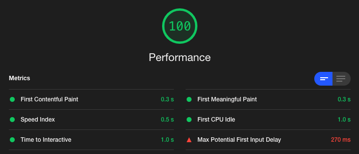
I’d thoroughly recommend reading this article by Google on user-centric performance metrics. The metrics we will be focusing on are the ones found within both the refreshed PageSpeed Insights tool and Google’s Lighthouse tool.
And what is the critical rendering path you may ask?
The critical rendering path is the steps that a browser completes to render and display content on a web page.
I thoroughly recommend you take a look at the below articles if you’re not clued up on what the critical rendering path is:
It’s very important when looking at site speed optimization that it’s the critical rendering path you focus on. If you’re optimizing page load time, rather than user-centric metrics measured by tools such as Lighthouse, you’re doing it all wrong!
An example, if you have a page load time of say six seconds, but the user can see and interact with the page within one second, that isn’t too bad.
If you have a page load time of six seconds but the user can’t see any content or interact with the page until five seconds have passed, that’s pretty poor from a user’s perspective.
That’s a pretty out-there comparison, but you get the point. By optimizing the critical rendering path, you’re focusing on the perceived load times, which is all that really matters to a user.
Now, for some tips on how to improve page load times.
File Optimization
Remove Render-Blocking Files
Removing render-blocking files has to be one of the best things you can do to improve the critical rendering path and important metrics such as your First Contentful Paint (FCP). If there is one thing you want to improve, put this towards the top of your list!
What does render-blocking mean?
Render blocking refers to when externally linked JS and CSS files prevent the browser from finishing parsing the HTML and showing the user the content of the page.
When a browser parses the HTML and finds CSS and JS files that have been externally linked to, it will stop parsing HTML and begin requesting, receiving, downloading, and then parsing those files. Until these files have been downloaded and parsed, the page will remain blank.
This can cause some pretty hefty delays, especially when the download sizes of the CSS or JS are larger.
There are three important steps to fixing this below:
1. Inline Critical CSS
The first thing you want to do to fix this is to inline any critical CSS in the <head> of the page. As you may have guessed, critical CSS is the CSS that is required to show above the fold content to the user.
When this CSS is inlined at the very top of the page in the <head>, the browser will parse it and then apply it to any HTML it finds before reaching a render-blocking file.
2. Defer Non-critical CSS
Now that critical CSS is being loaded, we need to defer any CSS that isn’t required for rendering above the fold content.
To do this, you need to load CSS files in a slightly different way than usual by using the rel=preload attribute as seen below.
<link rel="preload" href="styles.css" as="style" onload="this.onload=null;this.rel='stylesheet'">
<noscript><link rel="stylesheet" href="styles.css"></noscript>
The preload causes CSS to be loaded asynchronously and the onload attribute causes the CSS to be loaded once the page has finished loading.
The noscript tag is required to ensure CSS still loads for browsers that do not execute JavaScript.
WARNING: Do not do this unless you have first inlined your critical CSS. If you don’t, you are going to get a FOUT (flash of unstyled content)
Bonus tip: For browsers that do not yet support the preload attribute, you can JS polyfill by using the loadCSS library. Browser support is improving, but notably, Firefox doesn’t currently support it yet.
3. Defer Non-critical JS
Next, we need to fix any JS that is preventing content from being rendered by the browser. The default behavior of a browser loading JS looks like the below:

By deferring JS, the browser behavior changes to look a bit more like this:

Doing this is as simple as adding ‘defer’ to the tag.
<script defer src="example-script.js">If there is a small JS file that is essential for page load, consider inlining it in a similar fashion to what you did for critical CSS.
4. Move Render-blocking Files to the End of the Tag
Now, to make sure that any externally linked CSS files do not block the rendering of content move your non-critical CSS files to the very end of the page just before the closing the </body> tag.
I also recommend doing this for your deferred JS files. Whilst this shouldn’t make a difference for modern browsers that support the defer attribute, some older browsers do not support it and, therefore, could load the JS in a render-blocking way.
5. Remove Unused CSS
An obvious way to improve file optimization is to remove anything that is not ever actually used. CSS is one of the major culprits for this where CSS files are loaded globally across the site even though the CSS may not actually be required on that page.
For example, on an ecommerce site, CSS for the checkout page being loaded on the home page really isn’t necessary.
How to find unused CSS?
Personally, I am a fan of using Chrome Dev Tools to find unused bytes within files. To do this, open up Chrome Dev Tools (CMD + ALT + I on Mac) then head to Coverage report.
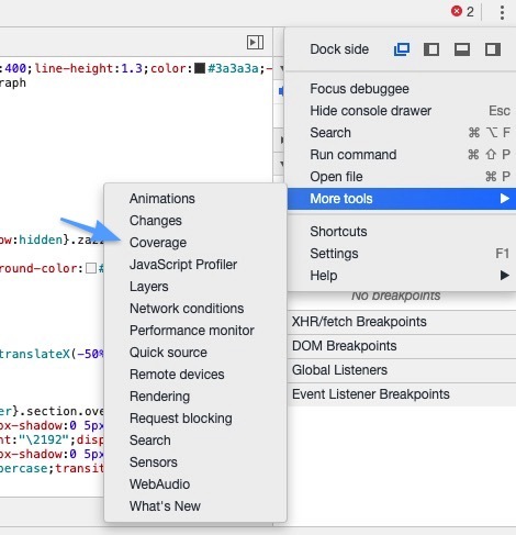
Once you are in there, click the record button and refresh your page.
You will then get a nice visualization showing the percentage of waste in each file you have loaded on the page.

Tools for Removing Unused CSS
There are multiple services for optimizing your CSS, so it only includes exactly what is required on that page:
Be aware: this needs to be run on a page by page basis and used with lots of testing. Most tools will give you clean files of CSS that only applies to what it could find within the DOM when it checked. If you are injecting additional HTML into the DOM after that time, with something like a popup, for example, the CSS to style that popup will not be within the clean CSS file.
6. Optimize Font Icons
Font icon packages have made it significantly easier for designers and developers to add life to their sites without great looking iconography.
However, due to the way in which these icons are delivered from popular libraries, they can add a significant amount of unused assets to a site. For example, the popular icon library FontAwesome can add around 300kb to the page when Gzipped and added to a page with the accompanying JavaScript files. For just the CSS file and font files, you are looking at closer to 100kb.
There are ways around this, though!
My personal favorite solution is creating your own icon font files using a service such as Fontello or Fontastic. These services make creating your own icon font files as simple as dragging and dropping the SVG or web font files you want over to the site, generating the font files and then uploading them to your own site.
Once you’ve done this, you will only be using the font icons that your site actually utilizes, which means faster load times for users.
7. Optimize Your Web Fonts
Custom fonts on the web are becoming more and more popular. Thanks to free font libraries such as Google Fonts and paid options such as Adobe Fonts (previously named Typekit), making a site look great with your own typography is becoming way easier.
Unfortunately, fonts can ruin the critical rendering path if they are slow to load, especially if you are loading them from a third party, which may be slower than your own server.
You can get some ugly scenarios such as FOUT (flash of unstyled text) or FOIT (flash of invisible text). This is where before the browser fully loads the font, it either shows your backup system default fonts, so the text is unstyled, or it waits for the font to finish downloading before it shows anything.
With FOIT specifically, if you are thinking of the critical rendering path, you may have spotted an issue.
If we’re waiting for a font to fully download before we show it to users, the perceived load times increase significantly as the user will see an almost blank page until it is done loading.
With FOUT, showing unstyled text isn’t great either, but at least the user sees something! Each browser by default chooses between FOUT or FOIT, here are the differences:
- Chrome hides text for up to three seconds. Then uses a system font until it is ready.
- Firefox hides text for up to three seconds. Then uses a system font until it is ready.
- Edge uses a system, then swaps out the fonts when the custom one is ready.
- Safari hides all text on the page until the custom font is ready.
Thankfully, there are ways to change the default behavior and also optimize your web fonts whilst you are at it.
A great guide on how to optimize web fonts can be found here. But to summarise what you should be doing:
- Utilize the font-display property and set it to swap. This instructs the browser to display an unstyled font straight away, improving the critical rendering path. Read more here.
- In the <head> of the page at the very top, preload your fonts. This tells the browser to start loading the font straight away, reducing the time that the user will see unstyled fonts.
- Different browsers like different fonts, so we need to list all fonts but then give resource hints using the format attribute.
- If you’re utilizing a CDN, considering self-hosting your fonts, you are then in control of how fast they load and aren’t impacted by a third-party hosted font that may be slower. Test this heavily, use lighthouse reports or Chrome Dev tools network tab to see how it impacts loading.
- If you are on Cloudflare, consider using a Cloudflare worker to automatically self-host Google Fonts on the fly.
- If you are on WordPress, take a look at this plugin. It will self-host Google fonts, preload, format, and implement the font-display property for you. Simple!
8. Image Optimization Tips
WebP
Images are one of the things that impact page size the most. Reducing overall page size is a great way to optimize the critical rendering path.
Unfortunately, high-resolution imagery and big banners have always killed page speed, especially on mobile, where you might be on a slower 3G or 4G connection.
Enter WebP images, developed by Google WebP, it reduces image file sizes by about 25 – 35% on supported browsers, although I’ve personally seen more. If you have an image-heavy ecommerce site, it makes sense to implement this as it will reduce server bandwidth usage whilst also making the site load faster.
Google has a list of WebP conversion libraries here that you can implement on your site to convert images to WebP, you can also use the Node.js library discussed here.
The only issue with WebP is browser support. For browsers that do not support it yet, if you just start using WebP images site-wide, anybody who has an unsupported browser will get blank images…not ideal!
The solution? The <picture> tag! Again, in the great CSS tricks article, you can find how to use this tag to support browsers that do and do not support WebP.
SVG
SVG is a scalable vector format (meaning quality stays the same regardless of the size), it is also very performance-friendly, and you can animate it!
Using the SVG format, you can expect file diagrams, logos, and illustrations to be significantly smaller; you can read more about it here. Considering the design trend of custom illustrations, SVG has to be something you have in your web development toolkit.
Want to see the power of SVG? Visit the Stripe site; they use them everywhere.
Check over some of your illustrations, logos, and diagrams. If they aren’t in the SVG format, get them changed to reduce the page size.
Lazy Load Images
This is probably a more obvious one and something a lot of sites are doing now (and Chrome shall soon support this by default!).
Given the size of images, it makes sense to only load them when required e.g., when the image is shown in the browser viewport.
Lazy loading does just that. On page load, only the images at the top of the page will be loaded. Once the user scrolls and more images come into view, they will then load. Simple and effective! Have a read over Google’s guide and also use a framework that utilizes the Intersection Observer API.
It is a more performance-friendly way of lazy loading, and it has the added bonus of being supported by the new updated version of Googlebot.
9. Pick a Better DNS Solution
Improving DNS lookup times on your own site is a great way to improve load times of all user-centric speed metrics as it is the first thing that has to happen when the page loads.
If you are using the default DNS given to you by your hosting provider, you are missing out on a great opportunity to improve the critical rendering path.
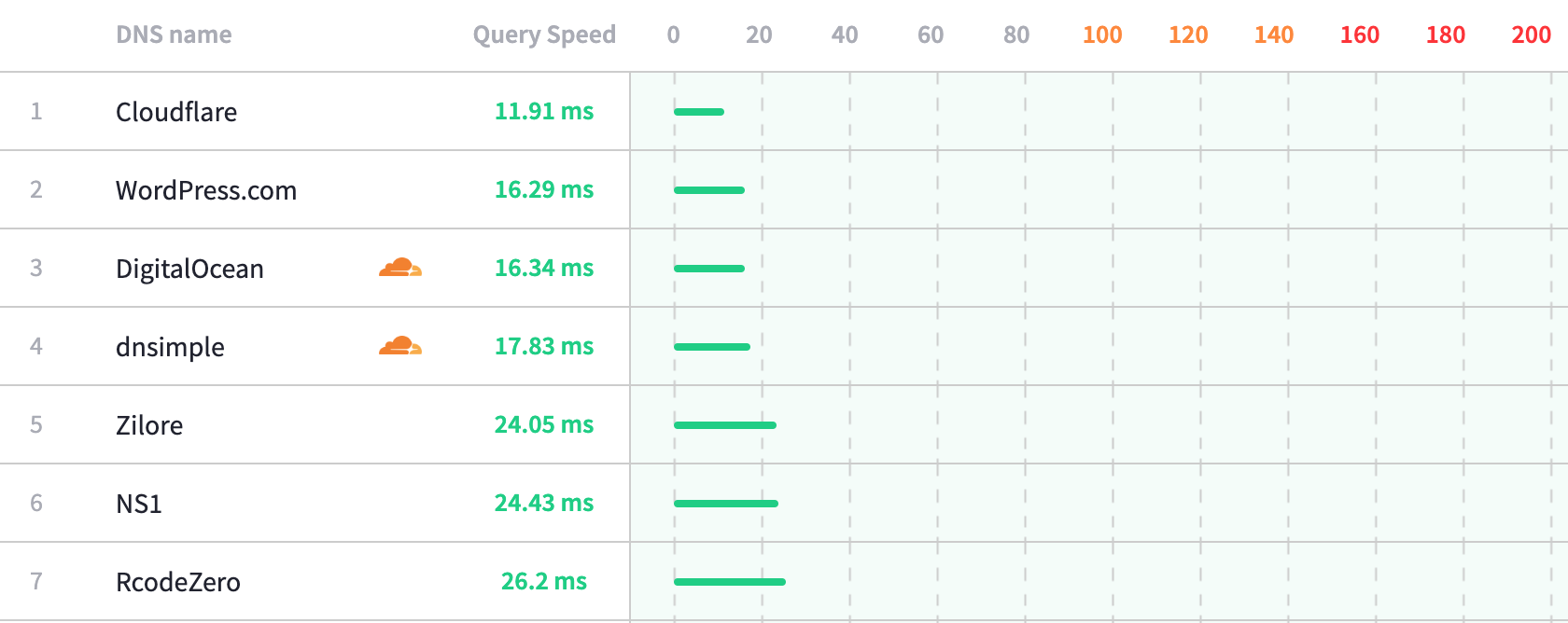
My default choice for DNS management is Cloudflare. It is the fastest DNS provider there is, it has a great admin area and is free. If you want help picking a better DNS provider, take a look at DNSPerf, it will give you some insights into which is faster.
10. Remove Animations Above the Fold
Animations are being used more and more in web design. Which is great! When used correctly, they can improve the user experience and make the browsing experience better all around.
However, when elements are fading in above the fold, this ruins all the hard work you have put into optimizing the critical rendering path. If you’re fading or sliding in an element above the fold, even with a quick 0.3 – 0.6s transition time, you have just delayed your first meaningful paint by that much.
This recommendation is pretty simple, avoid animating important content above the fold. Users will prefer to see the content quickly rather than a fancy animation that will soon become tedious.
11. Resource prefetching
What is prefetching?
Prefetching is a way to hint to a browser about resources that may be used in the future. When a resource is prefetched, the browser stores the contents of the resource within a local cache, once the user requests the resource, it is served from the browser cache, thus speeding up the loading and rendering of pages.
We mentioned one prefetching method earlier (called preload) when discussing font load optimization.
What can it be used for?
Prefetching can be used for:
- Performing a DNS lookup
- Entire web pages
- JavaScript files
- CSS files
- Any media files (fonts, audio, video, images, etc.)
There are multiple different ways of resource prefetching. Here is a bit of an overview of the differences between them:
- Preresolve Performs the DNS lookup for the next page
- Preconnect Like the above, but it also performs the TCP handshake and the optional TLS negotiation.
- Prefetch Also performs the HTTP request, useful for images and other files as, for example, we can instruct the browser that a certain image needs loading early on the current page
- Prerender Prerendering allows you to load a document and all resources found on a document. Not to be confused with prerender.io, which is a completely different type of prerendering!
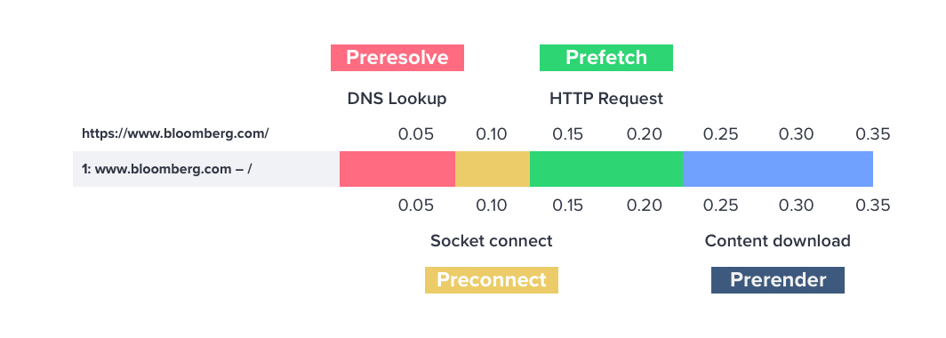
If you want some more details on the different types of prefetching, check this CSS Tricks article here.
Using Prerender for Instant Load Times
In this section, we’re going to be specifically focusing on how to implement prerender, here is an example of what the code looks like that you need to add the <head> of your site:
<link rel="prerender" href="https://www.example.co.uk/example1">Prerender is a great tool to have in your site speed optimization toolbox as you can make page load times seem almost instant for a user. This happens because the browser would have already fully loaded all assets to load the page before the user has navigated to it.
All you need to do is predict which page they are going to click on next and then start prerendering that page before they have clicked it.
Whilst this is obviously going to be great for load times, this tool has to be used with caution. If you start prerendering lots of URLs, you will quickly start wasting a user’s data plan and wasting server resources at the same time, especially if the user never even navigated to the URL.
There are a few different ways you can implement a prerender strategy:
- ‘Just-in-time’ prefetching – This is where you start prerendering a document when the user hovers over a link just before they click. There is around 300ms – 400ms between when a user hovers on a link and when they actually click it. So, what you can do is start prerendering the next URL as the user hovers. You can then improve user-centric metrics by a small amount and, if you’ve done other optimization, make your page load times feel instant.
- Predictive prefetching – This is where you utilize historical data on what users tend to click on next after visiting a page. As an example, you could use Google Analytics data to do this. That way, if a user hits the home page and then usually go to a specific category page next, we can start loading it in the background.
- Idle prefetching - When the viewport on a user’s browser is idle, you could prefetch all linked to URLs within the user's viewport.
Credit to Addy Osmani for his proposal on predictive fetching here.
Thankfully there are a few different tools you can use to quickly start making use of the prerender attribute.
Implement Just-in-time Preloading with Instant.page
You can really easily implement a just-in-time preloading strategy with a tool called instant.page. Installation is as simple as adding the script to your page.
Predictive Prefetching with Guess.js
Guess.js implements predictive prefetching by utilizing Google Analytics data. Be aware, this is an alpha product, so maybe don’t use it in a production environment yet.
Implement Idle Prefetching with Quicklink
There is another awesome free tool from the team at Google called Quicklink. Again, installation is quick and simple.
Quicklink attempts to make navigations to subsequent pages load faster. It:
- Detects links within the viewport (using Intersection Observer)
- Waits until the browser is idle (using requestIdleCallback)
- Checks if the user isn't on a slow connection (using navigator.connection.effectiveType) or has data-saver enabled (using navigator.connection.saveData)
- Prefetches URLs to the links (using <link rel=prefetch> or XHR). Provides some control over the request priority (can switch to fetch() if supported).
Personally, I really like this method of implementing prefetching as it is considerate for a user’s network and also whether they have data-saver enabled.
There is also a handy WordPress plugin to get this working on your site, simply install, and you are ready to go!
12. Cloudflare Edge Caching
I am a big fan of Cloudflare, but one thing you may notice when you implement the CDN is that your TTFB (time to first byte) actually drops.
This is due to Cloudflare not caching HTML on the edge by default. Every time a user visits a page on your site, Cloudflare will make a request to your server for the HTML of the page.
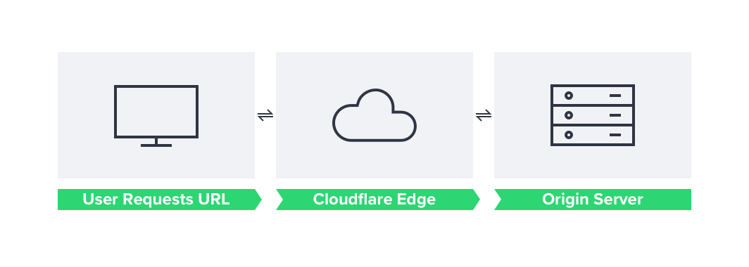
This can add around a 100ms delay to your TTFB. A slower TTFB is not what you want because this comes before all of our other user-centric metrics, such as first meaningful paint and first contentful paint, which will also be delayed.
This situation becomes even worse if you aren’t implementing any kind of HTML/page caching on your origin server.
However, Cloudflare does support HTML caching (or page caching) with the cache everything page rule. Once you have done this, Cloudflare will begin caching the origin’s response HTML until the cache is purged, thus completely removing the latency between the origin and Cloudflare.
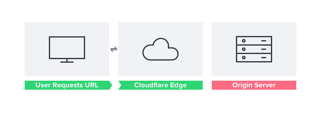
With the cache everything page rule, you could add rules across your site and then create other page rules that set the cache level to ‘bypass’ for more dynamic pages such as your site admin area.
Issues with Dynamic Elements
However, there are scenarios where this isn’t going to work. For example, if you have an ecommerce site that has dynamic elements such as the cart, header, checkout, and account pages, Cloudflare will show users whatever they have cached, removing the dynamic element of these pages/sections. In a worst-case scenario, users will begin seeing the cart and account pages for other users!
There are workarounds. One is to load these dynamic elements client-side using AJAX. A good example of this is with WooCommerce, as the majority of the cart elements are actually all AJAX-based. If you use this, Cloudflare will serve the HTML to the user, but then the browser will asynchronously work with the origin server to fill dynamic parts of the site.
If this isn’t the case, though, you will have to either create a user cache or bypass the edge cache based upon a cookie specifying whether the user is logged in or not.
Thankfully, most CMS have a cookie that you can use to bypass the cache on; you can see an example of this for WordPress here. The bad news is this is a business plan feature, so it will start costing £200 per month to have it (along with other great features).
Working Around This with a Cloudflare Worker
You can, however, work around this by using Cloudflare workers.
An example worker for doing this can be found here. It also comes with a handy WordPress plugin to add support for HTTP headers that the worker uses to identify whether the cache should be bypassed or not.
Once implemented, you should see significant improvements in load times, especially alongside some of the critical rendering path optimizations mentioned in this article.
Summary
Hopefully, you should now be able to go away with some of the above, advice and implement it on your site to improve speed and your conversion rates. Whilst there are loads of things you can do to improve site speed outside of the basics after you have implemented those and some of the above you should be seeing significantly better speeds.
If you have any questions, feel free to post in the comments below or tweet me @SamUnderwoodUK.
