Globally, there are around 5.3 billion people with internet access.
That means there’s more diversity online, a huge array of differing needs, and a pressing need for organizations with an online presence to be even more inclusive and more accessible.
As legislation around accessibility becomes stricter, ensuring that your website is sufficiently accessible now will help you mitigate compliance issues and expensive retrofitting in the future.
Is it time to check your website accessibility?
Remember that accessibility is about improving the user experience for everyone – including people with disabilities. And while content is always changing and going through updates, accessibility technology can dynamically support your site as it scales.
Here’s how to check for and address website accessibility issues in a few straightforward steps.
What is Website Accessibility?
Website accessibility refers to the development and design of websites that can be used by people of all abilities.
For example, websites should accommodate the needs of users with a wide range of needs, including those with visual impairments, motor control challenges, hearing loss, and cognitive disabilities.
Accessibility features such as color contrast, bigger text, compatibility with screen readers, keyboard shortcuts, or larger cursors can all reduce friction and user frustration while improving the overall user experience
It’s the responsibility of every organization to make sure that their websites are easy to navigate and use, without excluding any user groups.
Accessibility also makes clear economic sense: everyone should be able to use tools that are integral to everyday life – like shopping online or consuming videos.
By ensuring your website offerings are as inclusive as possible, you will reach a broader market.
Why Website Accessibility is a Must-have for All Organizations
By offering better accessibility, you’ll be ready to meet the diverse needs of users. Better still, you’ll be ready to deliver a great user experience for all of your clients and visitors.
Closed captions, for example, accommodate people with visual impairments and help younger people avoid distractions when watching content.
Other accessibility features include color contrast, keyboard navigation, alt text, and text-to-speech.
Compliance and User Needs: An On-going Responsibility
Accessibility from a usability perspective can be a moving target that shifts according to user needs. This makes user and website testing challenging but essential parts of accessibility.
Compliance around accessibility is equally dynamic. ADA Standards for Accessible Designs and Web Content Accessibility Guidelines (WCAG) both specify standards for websites to be accessible in the most up-to-date way. It’s key to keep on top of things, as laws around compliance become more demanding, and as our technological capabilities improve.
These resources can help you increase your websites’ level of accessibility and reduce the possibility of inadvertently being in violation of the law and risking lawsuits.
How to Check Website Accessibility in 5 Steps
These are ways you can review and improve your website accessibility manually. These are a useful starting point for accessibility, but should be built upon to maximize inclusivity.
1. Add Closed Captioning for All Videos and Audio Content

Closed captions - or subtitles - (as seen in the screenshot above) are words displayed either in sync with visual or audio content.
They assist people who have hearing difficulties as well as people who may be in a loud environment. Transcripts can often boost your SEO efforts as well.
The majority of video hosting platforms have an option to turn on closed captions when people view your content. Ensure this option is turned on, and review the content yourself to confirm that it works.
2. Include Alt text for Images
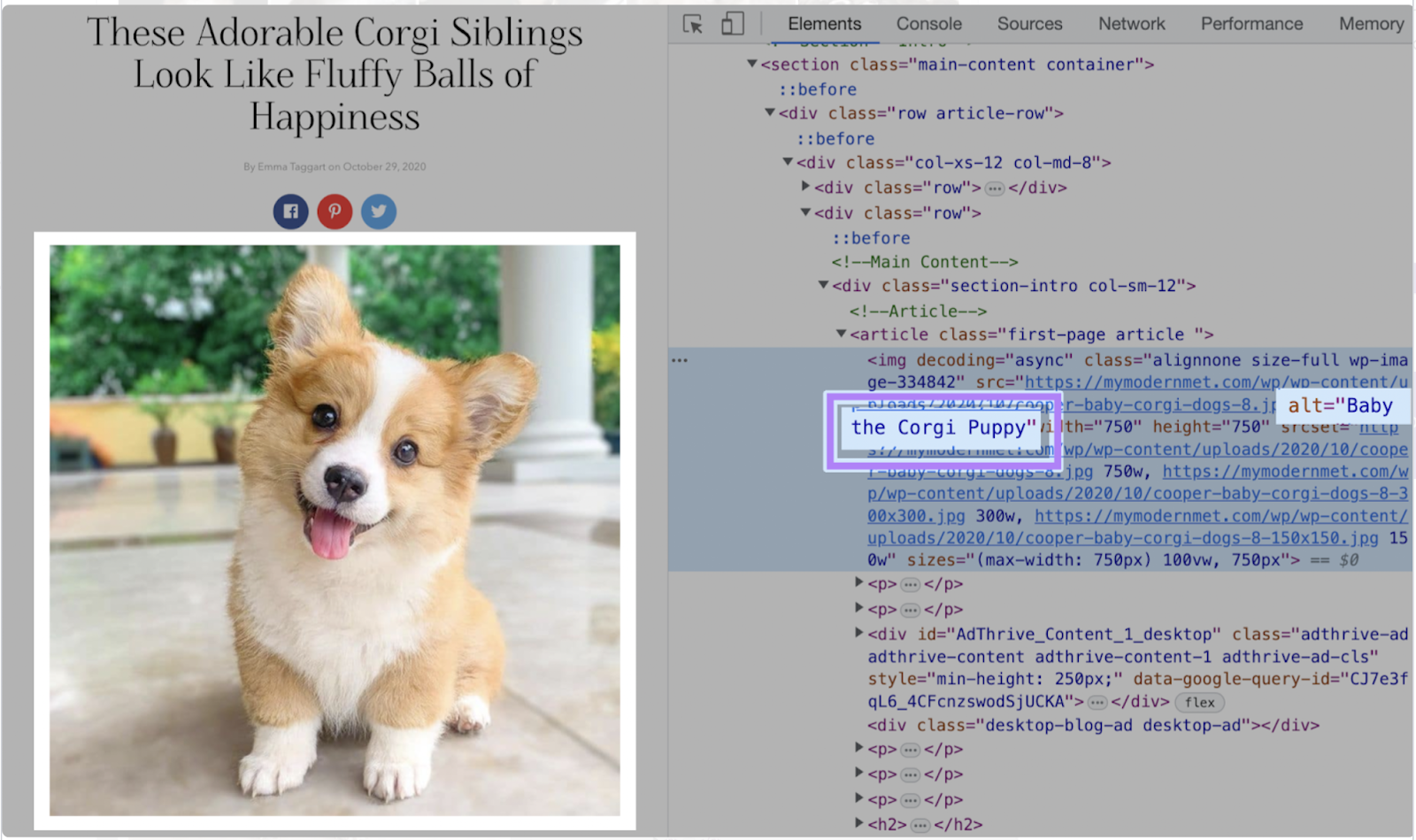
Alt text (alternative text) is a written description for non-text content like images and videos. It is used by assistive technologies, such as screen readers, to interpret the objects on screen for your users.

In the screenshot above, you can see the alt text “Baby the Corgi Puppy”. This alt text also loads in the event the image doesn’t display properly.
Alt text can be added to content through your website-hosting platform. Try to make it as clear, concise, and informative as possible.
You can also identify missing alt text with free accessibility scanner tools. It’s important to note that while a tool can tell you what content doesn’t have alt text, it can’t tell you if the alt text you do have is accessible enough.
3. Ensure Color Contrast
Color contrast is the difference in light between features in the foreground and the background of your website. The greater the difference, the easier it is for people to read and explore your website.
Strong color contrast is especially helpful for people with visual impairments and color blindness, but also for the majority of people to not strain their eyes.
The Web Content Accessibility Guidelines (WCAG)explain that optimal color contrast for text and images of text should be 4.5:1. Large text and images of large text should have a contrast ratio of at least 3:1.
To make these tech specs easier to follow, this free tool from a11y (a community-driven project to make accessibility easier) can highlight color contrast issues on your website.
4. Test Keyboard Navigation
Keyboard navigation lets people use your website without relying on a mouse. It allows people to scroll, open links, and carry out actions using keyboard controls. This is important for individuals with limited mobility.
Keyboard navigation requires clear visual indications of where a user is on a page and what actions they can take. For example, a drop-down menu may need to appear to let a user select an input for a form.
Checking your keyboard navigation:
- Try to complete tasks on your website using only your keyboard.
- Take note if there are flows that aren’t clear or if there are elements that you can’t reach.
- Encourage team members to do the same, and report any blocks as accessibility issues to address.
5. Use Heading Styles Correctly
Heading styles are the H1, H2, H3, etc. structures that define the hierarchy of content on your website. These not only make text look tidier, they also help users understand the flow of text and overall messaging.
At the same time, these headings inform screen readers and support visually impaired users reading your website.
In fact, you’ll notice this article has a number of H2 headings diving up the main sections of the text - and any subsections use H3s.
You can check your heading structures via your website backend or by right-clicking and selecting “inspect” on any web page. A number of free tools can show you pages that are missing heading styles.
Accessibility Testing Tools
Plenty of tools and resources exist to make checking your website accessibility a smoother process. These tools can automate checks and streamline how you create and conduct an accessibility strategy.
Take care to use these tools together with manual checks and lots of user testing – after all, accessibility should be by humans, for humans.
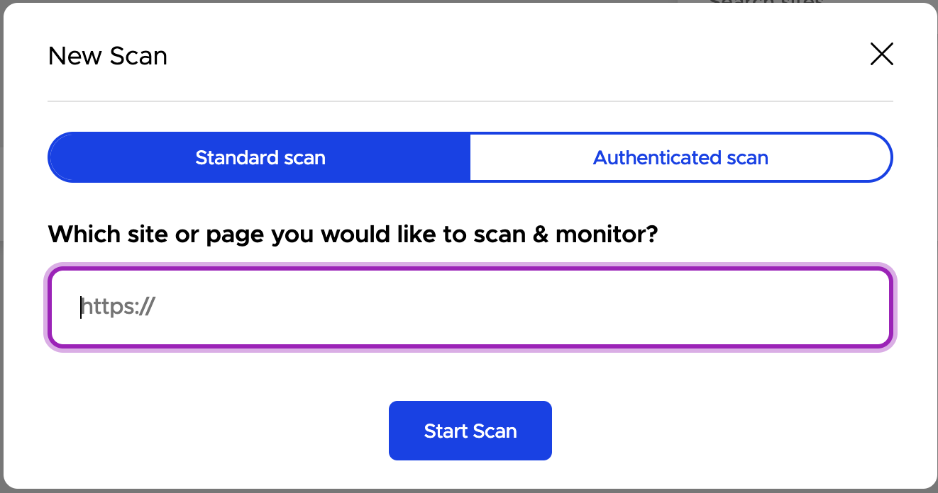
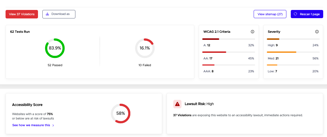
Accessibility Scan and Monitor is an app from the accessibility compliance platform UserWay. The tool uses AI to check websites’ WCAG and ADA compliance, including links, images, videos, and form fields that aren’t accessible-friendly.

The scan and monitor tool conducts up to 30,000 scans across 15,000 pages in under an hour, and also scans for issues that appear on specific sized devices and screens.

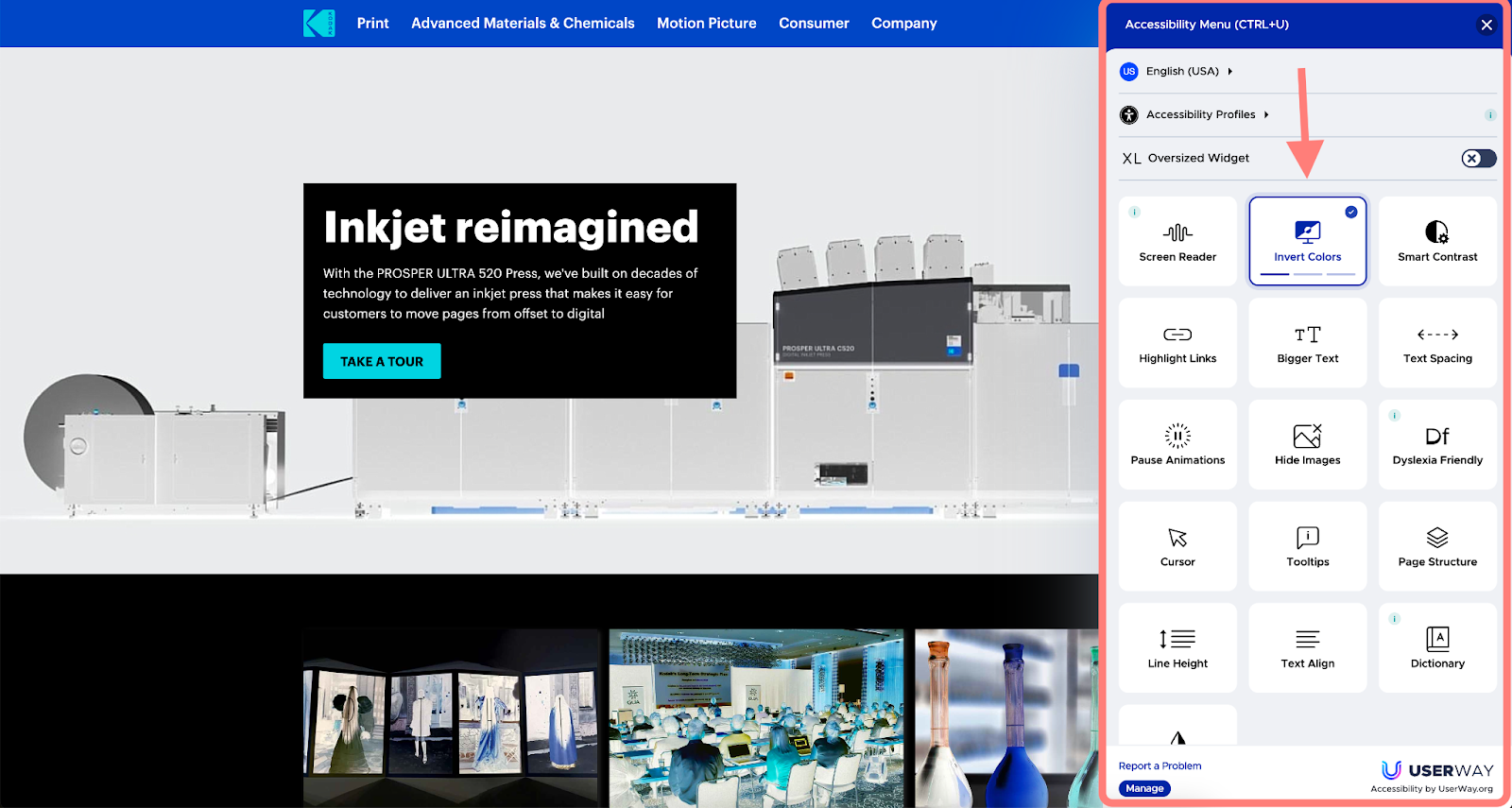
Another great tool from UserWay is the AI Accessibility Widget which automatically finds and fixes many accessibility compliance violations, round-the-clock. This helps make sure that websites are up to date with ADA and WCAG accessibility standards.

The Widget increases your website’s usability by adding a menu of accessibility options for visitors to access. It offers localized customer support in 57 languages – meaning more people from more locations can engage with your website.
On top of this, AI Accessibility Widget has a text-to-speech responsive voice tool that supports more than 50 languages.
Both of these tools empower companies to tap into new audiences, and have even been linked to increased earnings per click, increased click-through rates, reduced bounce rates, and increased conversion rates.
Take Advantage of These Accessibility Tools
Both the AI Accessibility Widget and the Accessibility Scan and Monitor are available for free for Semrush subscribers (on any plan, including the free plan). Simply navigate to the Semrush App Center to find them and get started.
Marketing and accessibility are connected. An accessible website inherently amplifies your brand’s voice, while marketing can showcase and project your brand’s accessible nature.
Having accessibility tools in your marketing tool belt allows you to address both more deeply and effectively.
What Are the Types of Accessibility Testing?
Rather than fixed types of accessibility testing, accessibility testing can be focused on the users that you’re catering to. That way, testing stays human-centric. Some of the groups you could orient your testing toward are (but not limited to):
- People with visual impairments
- People with hearing impairments
- People with mobility restrictions
- People with learning or cognitive disabilities
When it comes to checking website accessibility for these groups, you should strive to carry out testing in all of the following ways:
- Manual testing – have team members try website flows themselves and note any barriers.
- Automated testing – apply tools that repeatedly detect, fix, and flag accessibility problems.
- User testing – conduct regular interviews with a diverse group of people to gather information about how accessible they find your website.
How to Check ADA Compliance
ADA standards set the minimum requirements for building an accessible website. Alongside WCAG, it is the most commonly referred to document for accessibility.
ADA guidelines are a legal requirement for any business that operates for the benefit of the public. Failing to comply with the ADA can be costly – by the end of 2023, it’s predicted that 4,220 ADA website lawsuits were listed, averaging $25,000 per case.
In order to check your ADA compliance, start by embracing free tools and the tools mentioned above, and as always, continuously test your website with a diverse group of real users.
ADA standards are comprehensive, but the core principles are that your website is:
- Perceivable – all content and features are clear.
- Operable – all users can navigate the interface and complete interactions.
- Robust – all content can be interpreted by assistive technologies.
- Understandable – all information can be easily processed so users know what to do on the website.
Address Your Web Accessibility Today
Accessibility is an ongoing journey, not a destination. The sooner you start addressing your web accessibility, the sooner you can identify areas to improve and make changes that create an inclusive website.
Doing so means that you lower the risk of lawsuits, demonstrate your social responsibility, and open more doors for more people to use (and love) your website.
It’s easier than ever to get started with accessibility with Accessibility Scan and Monitor and AI Accessibility Widget.
