If B2B customers are from Mars, B2C customers are from Venus. With marketers crying hoarse about customer focused design, it should be glaringly obvious that B2B and B2C websites should be designed differently. First, a few key differences between B2B and B2C businesses and their customers.
Buying Behavior
Typically B2C has a much simpler buying process than B2B. B2C customers take a much shorter time to transition from interest to information and comparison, to the decision to buy. They are looking for convenience throughout the buying process, and want quick access to the information they need to evaluate the product and make a comparison.
They need a smooth checkout process and will sometimes click away if interrupted. For instance, different studies have shown that most of B2C customers hate it when they are forced to register for making a purchase, and would rather buy from elsewhere. B2C customers also have a variety of options available, so the design is the key element for making your site stand out.
The B2B buying process, on the other hand, comprises multiple stages and passes through approvals and personal interactions. Companies have clear policies and guidelines regarding procurement which they must follow. The process involves inviting proposals from multiple suppliers and evaluating the available alternatives against preset standards for cost and benefits.
For companies, it's the supplier that ticks most of the boxes on their checklist. B2B buyers would need more, and more focused information. You should not expect them to make online purchases without the personal involvement of your team at some stage.
Customer Psyche
Research shows that when two sellers are offering similar price and features, B2C customers make their purchase based on emotions. We buy emotionally and justify our decision logically. For B2C customers, perception plays a big role. Hence B2C websites need to differentiate from other sites in an effort to provide the essential emotional differentiation.
[Tweet: "B2C customers make emotionally based purchases."]
Attention must be paid to the emotional triggers guiding the purchase decision, so you should figure out which particular emotional needs your product fulfills. While trust is important and price does matter, in many cases, it is the 'feeling' associated with the product/service that leads to the purchase. The iPhone may have similar speed and features as cheaper brands, but it's Apple's branding that makes it so popular.
For B2B buyers, the emotion that drives their behavior is, arguably, fear! An individual making a purchase for his/her company is putting his/her career or reputation at stake. If the decision to buy from a particular supplier results in a bad experience, it could be bad for the person (or team) who took that decision.
Risk aversion is a major psychological factor for B2B buyers, hence there's a greater need to bolster their trust in your product or service. For B2B buyers, you need more detailed information and specifications to convince them at every stage of the sales cycle. Whereas emotions are still important, as they influence all of us, a B2B purchase decision is based on cold, hard calculations and comparisons.
[Tweet "Risk aversion often drives B2B buying decisions. #marketing"]
Decision Making
B2C customers are more inclined to taking impulsive decisions. Most B2C customers make the buying decision alone, particularly in case of low involvement products and services. They usually don’t have to justify their decision to others or wait for someone's permission. Hence, the design needs to be emotionally stimulating and fast flowing.
The headlines should be catchy and the copy should be short and appealing as your customers probably don’t have the patience or time to read through a lot of text to get what they need.
For B2B, it's almost always more than one person making the buying decision. Organizations have a set of procedures in place and have definitive criteria to measure their buying decision against. B2B buyers precisely know the kind of information they require in order to select a particular buyer. A B2B website should offer as much information as possible, in as many formats as possible, and as conveniently and promptly as possible.
Trust is another major factor behind a B2B buying decision. The person doing the buying is usually putting their reputation and career on the line, so they need to be absolutely sure that the company they are selecting will not let them down.
Implications for Web Design
B2C Web Design
- A B2C ecommerce website is visited by a large number of people and should be designed to appeal to the most prominent market segments. Whereas B2C sites usually have greater traffic than B2B, the conversion rates are significantly lower than B2B sites. Hence B2C websites should always have conversion optimization as an important design consideration.
- B2C web design should try to create differentiation through its visual appearance and user experience. It should look unique from its competitors and be highly usable. Enhancing the user experience should be a continuing activity for successful B2C websites.
- The catchiness of design matters, as does the speed with which the customer is taken through the different stages of the buying cycle – interest, information, comparison and purchase. Most of B2C purchases tend to be impulsive or emotional, and you don’t want your customer's euphoria to wear out by slowing them down. The right type of information should be offered at the right time, as concisely and clearly as possible, and action should be prompted at every step.
- The design should be clear and the information (or products) that the users require should be visible upfront. B2C ecommerce design generally uses minimal copy, compelling headlines, large images, and a more aggressive marketing style.
- A great B2C web design offers clear and upfront pricing and shipping info, provides a price or product comparison, and creates a sense of urgency or scarcity to entice its users into action.
- Work on ironing out the wrinkles in your sales funnel and checkout sequence. The journey between clicking the buy button and making the payment is crucial. You should do everything possible to minimize the number of dropouts during the checkout process.
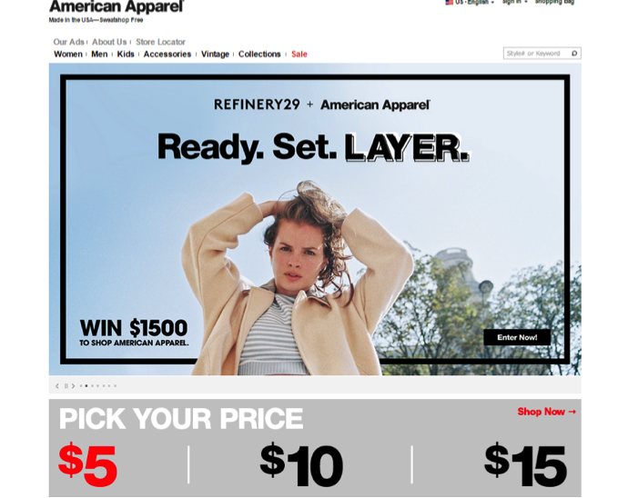
Example: See how American Apparel focuses on price, a key deciding factor for their customer, and uses a less wordy, more emotionally stirring design.

B2B Web Design
- B2B websites are visited by relatively fewer customers, but the volume of each purchase and the lifetime customer value (LCV) tend to be much greater than for B2C sites. B2B leads need more nurturing and attention, so the design should take this factor into account. Compelling action verbs and stimulating slogans may not be enough to lead the customers through the buying process.
- In the majority of cases, B2B design needs to be less visually differentiated and more thoroughly informative than B2C web design. Adequate information and knowledge about the product or service should be provided at each stage of the buying process. This would include offers for personal interaction or human contact at various points, so the design should integrate tools for such interactions.
- The typical buying process must be mapped out before starting the development process, along with the information required at each stage. The design should be focused more tightly on the information; hence a B2B site should offer videos, FAQs, and in-depth specifications about the product or service.
- The checkout process is less hectic than the B2C checkout sequence. However, the B2B sales funnel will require more nurturing at each step. Live chat, telephone numbers, and other modes of person to person interaction should be made available during the B2B checkouts. This would give your customers the feeling that you're there for them when they need your help.
- Use explainer videos, whitepapers, graphs and numbers, webinars, podcasts, Hangouts, and one-on-one demos as tools for providing information and instilling trust. Visualize the information that your buyers will need at different times and provide it proactively without them having to look for it.
What if You Serve Both B2B and B2C Customers?
There’s a huge gap between pure B2B websites and pure B2C websites. A whole host of websites serve both B2B and B2C customers. What you have to decide is what your majority customer profile looks like. Rounak Jain of ProLimeHost had exactly this issue and resolved it by simply profiling his visitors using Google Analytics. Upon then realizing that an overwhelming proportion of his visitors were B2B, he could then make decisions based on the correct data.
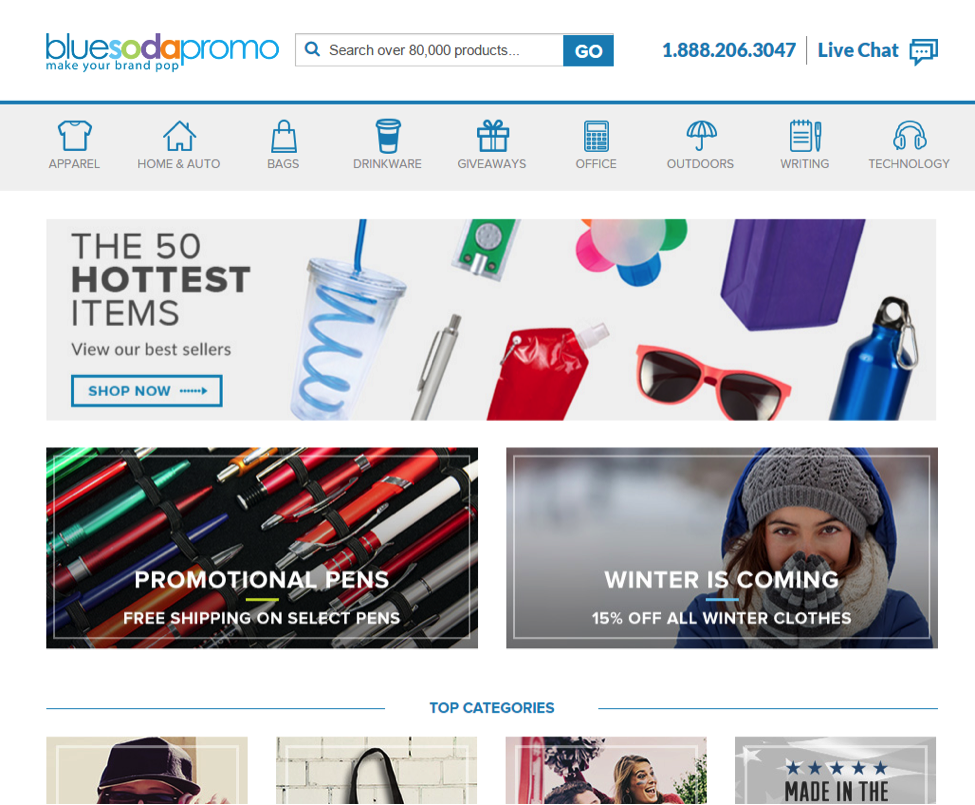
Example: Take a look at Blue Soda Promo’s homepage below. It's a B2C and B2B payment solution, and the design is built around the key information about the business.

Conclusion
B2B and B2C design is based on different considerations and demands different approaches. If the challenge for B2C web design is to minimize the time and hassle for its users, B2B design has trust and credibility as its core objective. It's basic marketing. You always design for your customers.
What B2C and B2B design challenges have you faced? Let us know in the comments!
Moosa Hemani is a search marketing consultant. He shares his thoughts and experiences on his blog setalks.com. Follow him on twitter (@mmhemani) to get in touch with him. His last article for SEMrush was entitled: “Is Rank Tracking Still Important?”
