Understanding user experience (UX) in search engine optimization (SEO) is about much more than page speed and content stability.
When optimizing UX from an SEO perspective, Google brings attention to how content is served, displayed, and viewed on a page. Ease of navigation, intrusive content, and design features are each important for earning higher organic search rankings.
In this article, we’ll dive deeper into how UX affects SEO and the most important metrics to track.
What Is SEO and UX?
SEO is defined as a set of processes aimed at improving a website’s page rankings in search engine results. UX is defined as the overall experience that a user has when interacting with a website.
In a perfect scenario, UX design creates a seamless, intuitive, and enjoyable experience for each user. Every time a user has a positive experience, it increases the likelihood of repeat usage. And repeat usage is often tied to making purchases.
UX encompasses every single touchpoint an individual encounters—from the ease of navigation to the clarity of information to the overall design of a website.
In Google Search Central’s guidelines, page experience is explained with the following set of questions:
- Do pages have good Core Web Vitals?
- Are pages served in a secure fashion?
- Does content display well for mobile devices when viewed on them?
- Does the content lack an excessive amount of ads that distract from or interfere with the main content?
- Do pages lack intrusive interstitials?
- How easily can visitors navigate to or locate the main content of your pages?
- Is the page designed so visitors can easily distinguish the main content from other content on your page?
Google’s helpful content guidelines point out that site owners should focus on providing an overall great page experience, rather than just incorporating one or two aspects.
Let’s take a more in-depth look.
What Is the Role of UX in SEO
SEO and UX share a primary objective: to create websites that efficiently cater to user needs. When evaluating a website’s performance, search engine algorithms don’t exclusively focus on technical aspects—they also monitor interactions with a website to gauge the type of user experience it offers.
To clarify the role of UX, we’ll discuss page load speed, mobile-first indexing, UX writing, site architecture, and aesthetics in SEO.
Page Load Speed
As stated in Google’s developer guidelines on Core Web Vitals, page speed is a significant ranking factor. If the first input takes more than 100 milliseconds to load, the page won’t meet good UX guidelines. The same occurs if the largest asset on the page takes more than 2.5 seconds to load. If either of these scenarios occur, it harms the ability of the page to rank.
So, how can you enhance your website’s speed?
There are several design-centric and technical best practices to adhere to:
- Optimize Code: Minimize CSS, JavaScript, and HTML code to speed up the site.
- Optimize Images: Reduce the size or clarity of images just enough to expedite load speed without sacrificing quality.
- Lazy Loading: A web design method that postpones loading of specific elements until they’re absolutely needed (i.e. loading images ‘below the fold’ only once a user begins to scroll).
To analyze page speed within your own website, use the Semrush Site Audit tool and then select “Site Performance.”
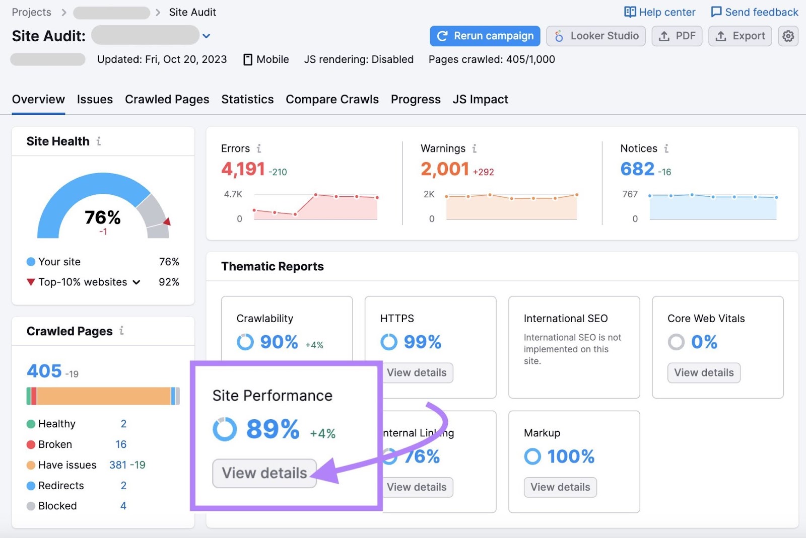
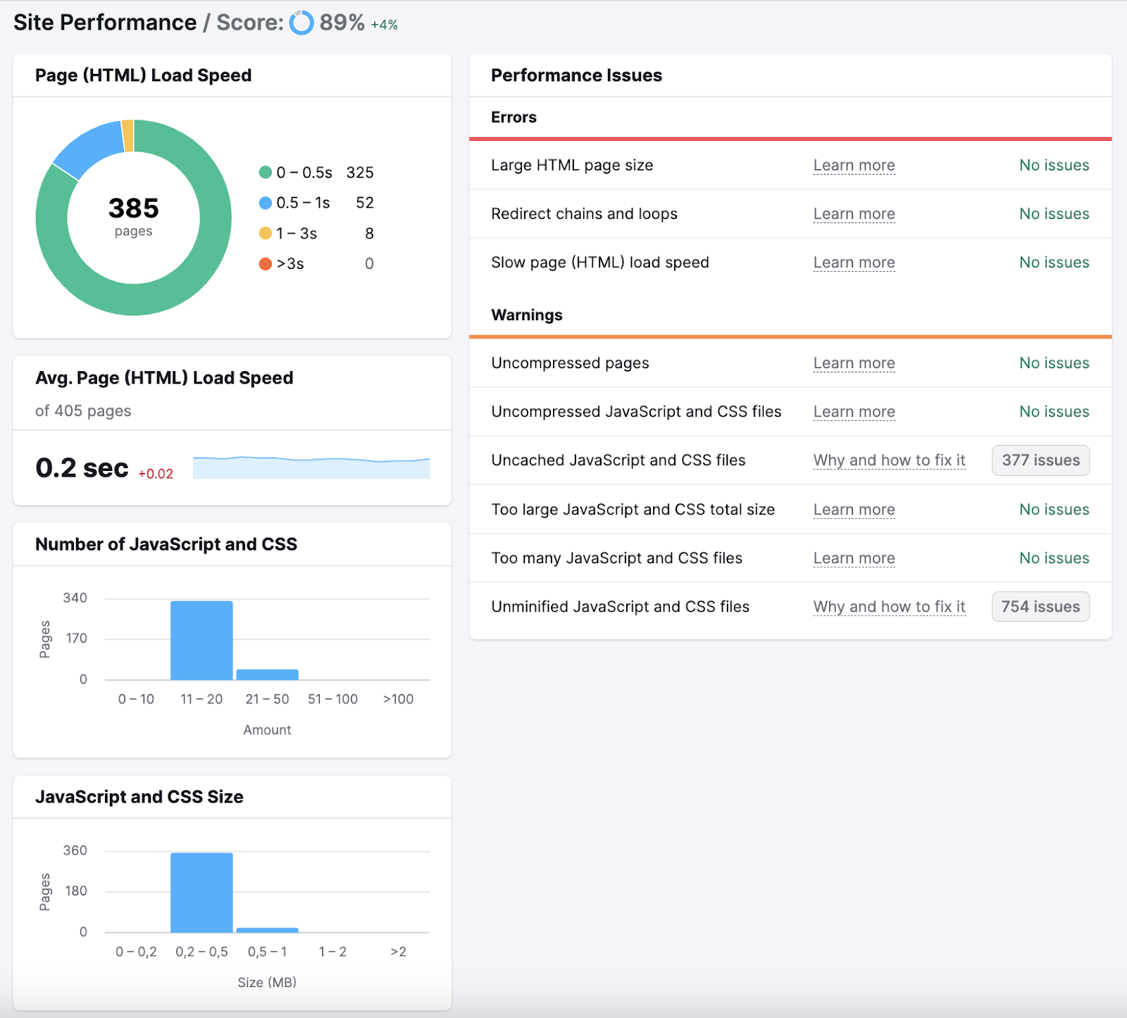
The report will compile information about page load speed and performance into a report that looks like the image below. You’ll get suggestions for elements that you can optimize based on their level of impact on page speed.
Mobile-first Indexing
Google prioritizes the mobile version of a website’s content when crawling, indexing, and ranking pages. By default, mobile-first indexing is enabled for all new websites (new to the web or previously unknown to Google Search). This means you must ensure your mobile pages have the same quality content as desktop pages to maintain your rankings.
Most CMS website templates will handle responsiveness across desktop and mobile screens. Still, some manual editing may be needed. Below are a few ways you can ensure a mobile-friendly website:
- Responsive web design: Google recommends this configuration because it’s the easiest to implement and maintain. Responsive web design means serving the same HTML code on the URL regardless of the user’s device.
- Duplicate content on desktop and mobile: Having the same content served on desktop and mobile ensures the two versions can rank for the same keywords. You can still optimize the mobile UX by featuring a different design, such as accordions or tabs, but the content should be the same.
- Check visual content: Ensure the images and videos on your mobile site follow Google’s image and video best practices. Don’t use images that are too small. Don’t use images that have low resolution. Make sure your mobile site and desktop site have the exact alt text for each image.
UX Writing and Intent
The copy you feature on your website is one of the fundamental aspects of UX. It’s an instrumental tool for guiding a user through your website and affects how long someone stays engaged.
Google works to ensure that when it directs users to your website via search engine results pages (SERPs), they can easily find the information they’re looking for.
The more effective your website copy, the easier it is for users to navigate. This results in longer and/or repeat visits to your website site and, ultimately, more conversions.
Some effective tips for UX writing include:
- Using plain language
- Writing in an active voice
- Avoiding confusing jargon
- Writing in clear language
- Applying ‘less is more’
- Writing short sentences
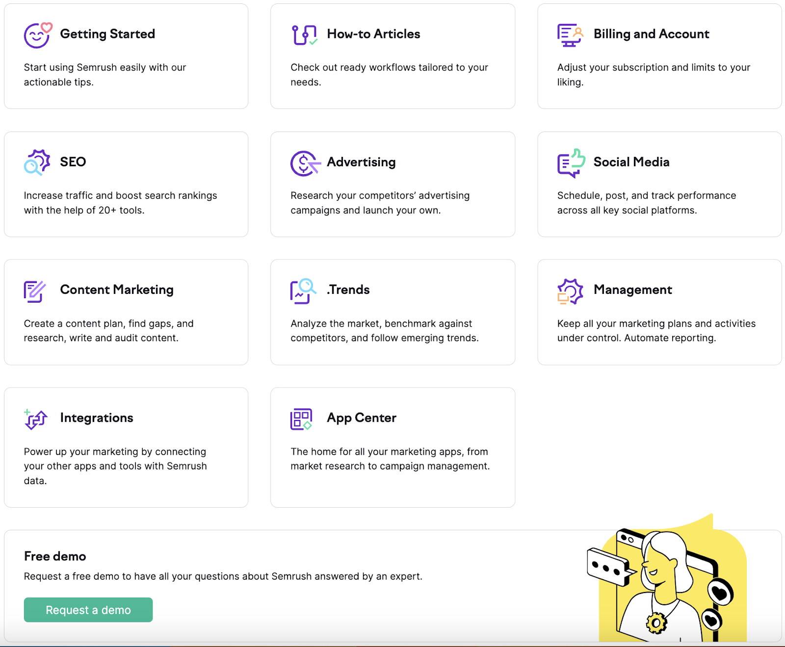
Here’s an example from our own Help Center. The entire purpose of the page below is to help our customers understand how to use Semrush. The design needs to be as clear and concise as possible, so the copy, placement, order, and design all need to work together as one.
Site Architecture, Navigation, and Crawling
Similarly, a website’s overall navigation and layout should be crafted to maximize user-friendliness. To do this, navigation should be as intuitive as possible.
Think of website copy as road signs for a driver—pointing a visitor in the right direction so they can make quick decisions without exerting too much effort.
Luckily, when done correctly, the architecture of your website serves a dual function:
- From a UX perspective, it should offer a coherent, intuitive route for visitors as they traverse your website.
- From an SEO perspective, it presents a guide for search engines, offering a snapshot of all the content on your site and the connections between them.
When it comes to website structure and navigation, always prioritize the user. Create pathways for a human visitor to follow. The crawling structures used by search engines will naturally benefit.
The same applies to the layout of individual pages. Order your content logically and clearly with menus, headers, and calls to action. If users can navigate your website with ease, so can search engine algorithms.
In order to check whether your site architecture is easy to navigate and crawl, you can use Semrush Log File Analyzer tool. This report reviews:
- Were any errors detected during the crawling process?
- Are there any pages not being crawled?
- Are you efficiently spending your crawl budget?
- Which pages get crawled the most?
- Are you able to manage Googlebot’s crawling?
You’ll see reports for bots, status codes, file types, and more. Here’s an example of the report Semrush provides about Googlebot activity:

Website Aesthetics and SEO
UX design extends beyond creating an appealing look for your website.
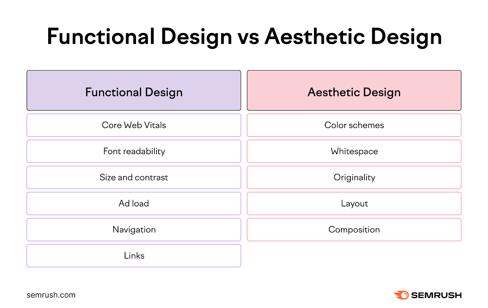
Google’s Core Web Vitals attempt to quantify the functional design of a site’s UX. These rules are aimed at ensuring a uniform brand experience and helping the user along the path created by the UX designer. But this is only one aspect of the overall design concept.
The other aspect—which is less concrete but just as influential—relates to the site’s aesthetic design.
For the purposes of SEO, we can simplify UX design into two parts: functional design and aesthetic design.
A well-designed and aesthetically pleasing website can impact time on page, returning traffic, brand searches, and SERP click-through rate (CTR).
With this in mind, let’s expand on the most important UX metrics for SEO.
The Most Important UX Metrics for SEO
As mentioned above, Google’s assessment of your website isn’t limited to technical factors. It also monitors user interactions and the different ways they engage with your content.
This means that user engagement metrics are a clear reflection of your website’s quality. So, if you improve your site’s UX, you’re also boosting your SEO performance.
Below are the most important metrics to track.
Core Web Vitals for Page Speed and Stability
Core Web Vitals illustrates three key metrics to simplify the process of UX for business owners, marketers, or anyone looking to maximize performance.
These metrics can be categorized into loading, interactivity, and visual stability. This can be explained as:
- How long does it take for the largest asset to load? This could be an image, video, or overall design.
- How much delay is there when interacting with the site? The longer it takes for the site to respond to a user interaction, the poorer the page experience.
- How stable is the site when browsing? If the user can visually tell that the layout is changing when browsing around the site, the page experience is poor.
These metrics have been categorized as Largest Contentful Pain (LCP), First Input Delay (FID), and Cumulative Layout Shift (CLS). Here’s how they’re measured:
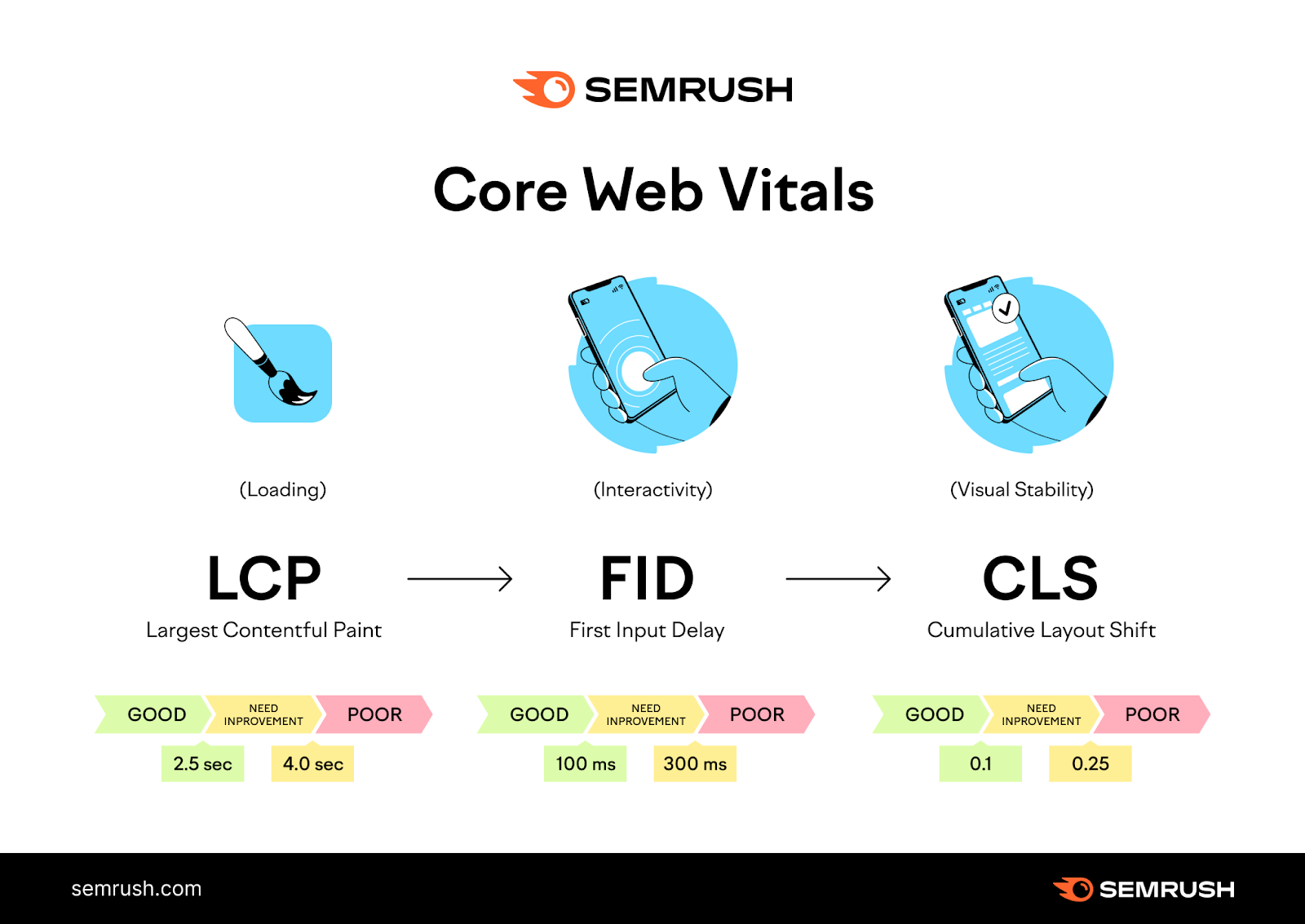
- Largest Contentful Paint (LCP): This measures the time it takes for the main content to load. For optimal user experience, LCP should take place within the first 2.5 seconds of the page beginning to load.
- First Input Delay (FID): This measures your page’s response time during initial user interactions. To ensure a satisfying user experience, a page should achieve a FID of 100 milliseconds or less.
- Cumulative Layout Shift (CLS): This measures the number of distracting shifts in the layout as users scroll through the website. For a positive user experience, a page should aim for a CLS of 0.1 or less.
Web Vitals was created with the intention of offering comprehensive guidelines on crucial quality indicators for optimal UX. Basically, it’s a way for website owners to maximize their understanding of UX without having to become a performance expert.
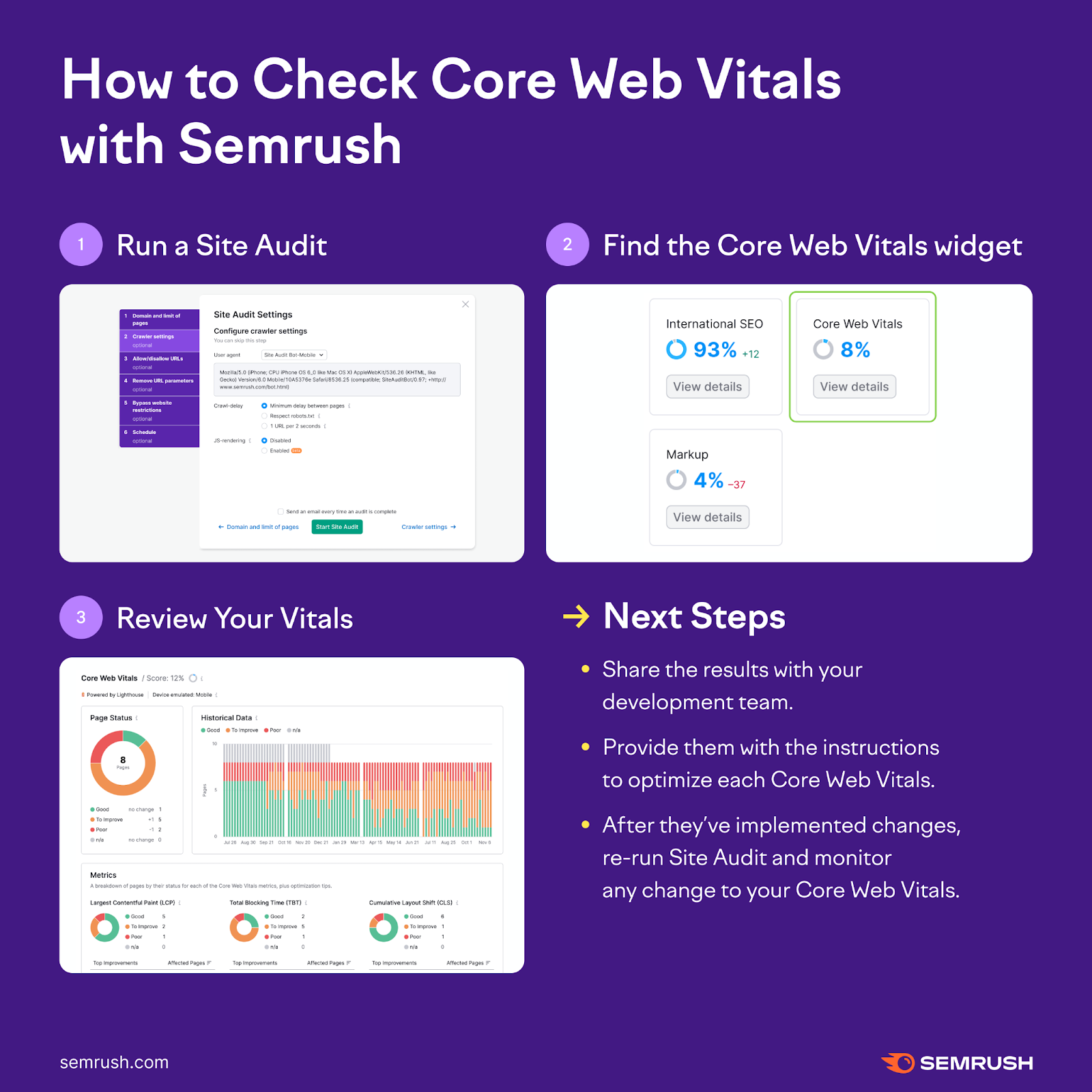
You can do a Core Web Vitals assessment and learn how to improve aspects like page speed within Site Audit. Here’s a quick visual overview of the steps:
Engaged vs. Non-Engaged Sessions
With the release of Google Analytics 4, bounce rate, page sessions, and time on page have been slightly adapted for how they’re calculated in comparison with Universal Analytics. These metrics are now considered part of an “engaged session,” meaning that the user remained on the page longer than 10 seconds, viewed at least two pages, or initiated a conversion.
On the other hand, the bounce rate is defined as the percentage of sessions where no engagement happened.
Engaged sessions and bounce rate are then tracked as “metrics”:
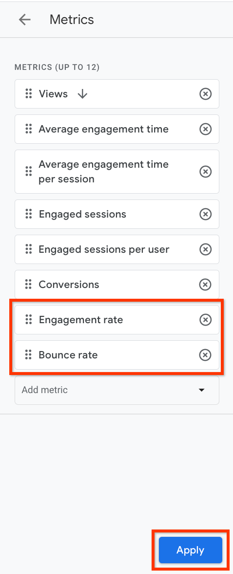
Source: Google Support docs
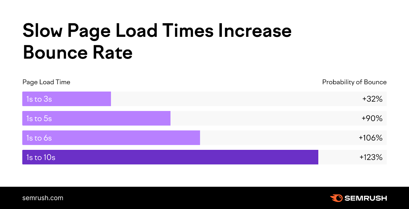
A high bounce rate can indicate that users aren’t finding what they need—or the opposite—that they’re finding what they need right away. Similarly, if users spend little time on your pages, it may suggest that the content isn’t engaging or meeting their needs.
Low bounce rate and more pages viewed per session typically indicate an engaging UX, meaning that users are finding value while exploring your site.
Heatmap Statistics for Advanced User Behavior
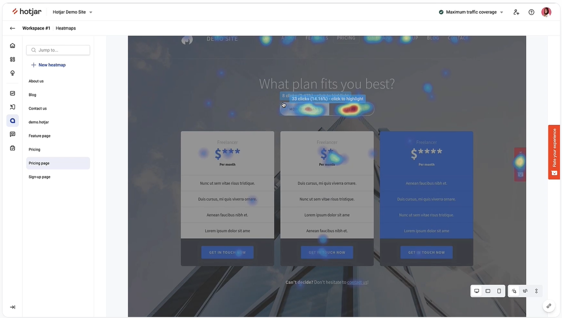
Another way to analyze UX is through the use of heatmapping tools, such as Hotjar. Heatmapping tracks clicking, mouse movement, and scrolling. It allows you to dive deeper into user behavior and gain an understanding of how people move through and interact with elements of your website.
When applying heatmapping data to a UX analysis, the goal is to visually identify where your website may need UX improvements.
For example, if users stop scrolling on a page, it could indicate that the page is too long or too complex. If several users click on assets that are non-clickable, it could be beneficial to add hyperlinks to guide the users further for a better experience.
Build a Unified Strategy for UX and SEO with Semrush
A unified strategy for UX and SEO requires work and coordination upfront, but the long-term benefits are well worth the effort. By focusing on users’ needs and matching them to search engine requirements, you can more easily connect your brand with motivated customers.
Semrush makes it easy to see a comprehensive, single-page view of key website metrics and SEO trends. Track user metrics, top page views, total impressions, average CTR, and more. When you’re ready to get started, give Semrush a try—for free!
